
2.1: Background Material
- Page ID
- 28044

\( \newcommand{\vecs}[1]{\overset { \scriptstyle \rightharpoonup} {\mathbf{#1}} } \)
\( \newcommand{\vecd}[1]{\overset{-\!-\!\rightharpoonup}{\vphantom{a}\smash {#1}}} \)
\( \newcommand{\dsum}{\displaystyle\sum\limits} \)
\( \newcommand{\dint}{\displaystyle\int\limits} \)
\( \newcommand{\dlim}{\displaystyle\lim\limits} \)
\( \newcommand{\id}{\mathrm{id}}\) \( \newcommand{\Span}{\mathrm{span}}\)
( \newcommand{\kernel}{\mathrm{null}\,}\) \( \newcommand{\range}{\mathrm{range}\,}\)
\( \newcommand{\RealPart}{\mathrm{Re}}\) \( \newcommand{\ImaginaryPart}{\mathrm{Im}}\)
\( \newcommand{\Argument}{\mathrm{Arg}}\) \( \newcommand{\norm}[1]{\| #1 \|}\)
\( \newcommand{\inner}[2]{\langle #1, #2 \rangle}\)
\( \newcommand{\Span}{\mathrm{span}}\)
\( \newcommand{\id}{\mathrm{id}}\)
\( \newcommand{\Span}{\mathrm{span}}\)
\( \newcommand{\kernel}{\mathrm{null}\,}\)
\( \newcommand{\range}{\mathrm{range}\,}\)
\( \newcommand{\RealPart}{\mathrm{Re}}\)
\( \newcommand{\ImaginaryPart}{\mathrm{Im}}\)
\( \newcommand{\Argument}{\mathrm{Arg}}\)
\( \newcommand{\norm}[1]{\| #1 \|}\)
\( \newcommand{\inner}[2]{\langle #1, #2 \rangle}\)
\( \newcommand{\Span}{\mathrm{span}}\) \( \newcommand{\AA}{\unicode[.8,0]{x212B}}\)
\( \newcommand{\vectorA}[1]{\vec{#1}} % arrow\)
\( \newcommand{\vectorAt}[1]{\vec{\text{#1}}} % arrow\)
\( \newcommand{\vectorB}[1]{\overset { \scriptstyle \rightharpoonup} {\mathbf{#1}} } \)
\( \newcommand{\vectorC}[1]{\textbf{#1}} \)
\( \newcommand{\vectorD}[1]{\overrightarrow{#1}} \)
\( \newcommand{\vectorDt}[1]{\overrightarrow{\text{#1}}} \)
\( \newcommand{\vectE}[1]{\overset{-\!-\!\rightharpoonup}{\vphantom{a}\smash{\mathbf {#1}}}} \)
\( \newcommand{\vecs}[1]{\overset { \scriptstyle \rightharpoonup} {\mathbf{#1}} } \)
\(\newcommand{\longvect}{\overrightarrow}\)
\( \newcommand{\vecd}[1]{\overset{-\!-\!\rightharpoonup}{\vphantom{a}\smash {#1}}} \)
\(\newcommand{\avec}{\mathbf a}\) \(\newcommand{\bvec}{\mathbf b}\) \(\newcommand{\cvec}{\mathbf c}\) \(\newcommand{\dvec}{\mathbf d}\) \(\newcommand{\dtil}{\widetilde{\mathbf d}}\) \(\newcommand{\evec}{\mathbf e}\) \(\newcommand{\fvec}{\mathbf f}\) \(\newcommand{\nvec}{\mathbf n}\) \(\newcommand{\pvec}{\mathbf p}\) \(\newcommand{\qvec}{\mathbf q}\) \(\newcommand{\svec}{\mathbf s}\) \(\newcommand{\tvec}{\mathbf t}\) \(\newcommand{\uvec}{\mathbf u}\) \(\newcommand{\vvec}{\mathbf v}\) \(\newcommand{\wvec}{\mathbf w}\) \(\newcommand{\xvec}{\mathbf x}\) \(\newcommand{\yvec}{\mathbf y}\) \(\newcommand{\zvec}{\mathbf z}\) \(\newcommand{\rvec}{\mathbf r}\) \(\newcommand{\mvec}{\mathbf m}\) \(\newcommand{\zerovec}{\mathbf 0}\) \(\newcommand{\onevec}{\mathbf 1}\) \(\newcommand{\real}{\mathbb R}\) \(\newcommand{\twovec}[2]{\left[\begin{array}{r}#1 \\ #2 \end{array}\right]}\) \(\newcommand{\ctwovec}[2]{\left[\begin{array}{c}#1 \\ #2 \end{array}\right]}\) \(\newcommand{\threevec}[3]{\left[\begin{array}{r}#1 \\ #2 \\ #3 \end{array}\right]}\) \(\newcommand{\cthreevec}[3]{\left[\begin{array}{c}#1 \\ #2 \\ #3 \end{array}\right]}\) \(\newcommand{\fourvec}[4]{\left[\begin{array}{r}#1 \\ #2 \\ #3 \\ #4 \end{array}\right]}\) \(\newcommand{\cfourvec}[4]{\left[\begin{array}{c}#1 \\ #2 \\ #3 \\ #4 \end{array}\right]}\) \(\newcommand{\fivevec}[5]{\left[\begin{array}{r}#1 \\ #2 \\ #3 \\ #4 \\ #5 \\ \end{array}\right]}\) \(\newcommand{\cfivevec}[5]{\left[\begin{array}{c}#1 \\ #2 \\ #3 \\ #4 \\ #5 \\ \end{array}\right]}\) \(\newcommand{\mattwo}[4]{\left[\begin{array}{rr}#1 \amp #2 \\ #3 \amp #4 \\ \end{array}\right]}\) \(\newcommand{\laspan}[1]{\text{Span}\{#1\}}\) \(\newcommand{\bcal}{\cal B}\) \(\newcommand{\ccal}{\cal C}\) \(\newcommand{\scal}{\cal S}\) \(\newcommand{\wcal}{\cal W}\) \(\newcommand{\ecal}{\cal E}\) \(\newcommand{\coords}[2]{\left\{#1\right\}_{#2}}\) \(\newcommand{\gray}[1]{\color{gray}{#1}}\) \(\newcommand{\lgray}[1]{\color{lightgray}{#1}}\) \(\newcommand{\rank}{\operatorname{rank}}\) \(\newcommand{\row}{\text{Row}}\) \(\newcommand{\col}{\text{Col}}\) \(\renewcommand{\row}{\text{Row}}\) \(\newcommand{\nul}{\text{Nul}}\) \(\newcommand{\var}{\text{Var}}\) \(\newcommand{\corr}{\text{corr}}\) \(\newcommand{\len}[1]{\left|#1\right|}\) \(\newcommand{\bbar}{\overline{\bvec}}\) \(\newcommand{\bhat}{\widehat{\bvec}}\) \(\newcommand{\bperp}{\bvec^\perp}\) \(\newcommand{\xhat}{\widehat{\xvec}}\) \(\newcommand{\vhat}{\widehat{\vvec}}\) \(\newcommand{\uhat}{\widehat{\uvec}}\) \(\newcommand{\what}{\widehat{\wvec}}\) \(\newcommand{\Sighat}{\widehat{\Sigma}}\) \(\newcommand{\lt}{<}\) \(\newcommand{\gt}{>}\) \(\newcommand{\amp}{&}\) \(\definecolor{fillinmathshade}{gray}{0.9}\)Graphical Methods
Very often our experiments are intended explore the mathematical relation between two quantities. Such experiments test an hypothesis that posits a certain functional relationship. For example, suppose we wanted to test the theory that objects dropped from rest fall a distance that is proportional to the square of the time elapsed after being released:
\[\text{distance fallen}=\Delta y\propto \Delta t^2 \]
How does one test such a proposition? Naturally lots of trials are required, where the time of descent and distance fallen are both measured. Multiple trials are needed for two elements of such an experiment. First, as we have already seen, we need to do several runs for fixed values of \(\Delta y\) and \(\Delta t\) in order to determine the uncertainties of our measurements. But we also need to do trials at a variety of values of \(\Delta y\) and \(\Delta t\), so that we can test the functional dependence. We can never perform enough experiments to prove the relation beyond a doubt. As we saw in the previous lab, hypotheses that are framed as one conclusion against the entire universe of alternatives all suffer from this shortcoming, and it is generally better to do a direct comparison of two specific possibilities (in the previous lab, this consisted of framing the hypothesis in terms of aiming at target A or target B). So rather than use our data to confirm a single mathematical relation, we would use it to determine the relative merits of two competing mathematical relations.
There is a very powerful method for evaluating an hypothesis of this kind using the data acquired from all these trials. This method consists of plotting the data on a graph, and then checking to see which of the perspective formulas produces a graph that most closely fits the data (this is called a best-fit curve). There is software that does this for us, but rather than throwing this task into a black box, we get a better understanding if we do this "by hand," at least for awhile. When we plot the data points, we will undoubtedly notice that they follow some sort of curve, but it is not always obvious to the naked eye what function best fits those points. Consider the data points shown in the graph below, and two curves that we think may potentially express the correct functional dependence.
Figure 2.1.1 – Data Points and Two Prospective Curves
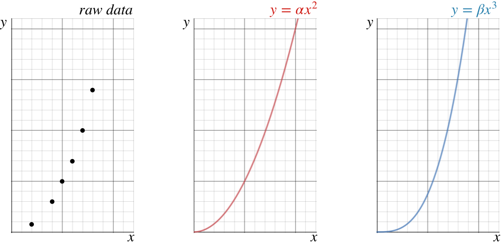
It certainly isn't clear from looking at the data alone which of the two prospective functions best fits it. If we superimpose the data points with the curves, we get a sense that perhaps the quadratic fits better than the cubic, but given the uncertainties in the measurements, it is by no means certain. What is more, creating these prospective curves is tricky business, since we are only testing power-dependence, which means we don't know what the values of \(\alpha\) and \(\beta\) are. We have to keep tweaking these parameters until the curves are the best they can be – a very tedious task.
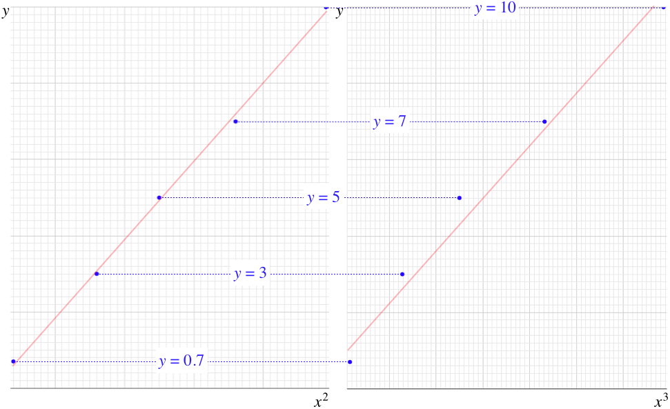
The main problem is that we humans are not particularly good at judging curvature of an array of points, and this can get even worse for functions more complicated than the two shown above. We are, however, pretty good at evaluating straight lines. It is therefore useful to change the graphs above to straight lines by plotting the \(y\) value versus the prospective powers of \(x\). That is, make two plots of the data like the one on the left of the figure above, but plot \(y\) vs. \(x^2\) for one graph, and \(y\) vs. \(x^3\) for the other. Then take a straight-edge and see how well these data points can be aligned along it for the two cases. Whichever set of points more closely approximates a line is the one that reflects the functional dependence better.
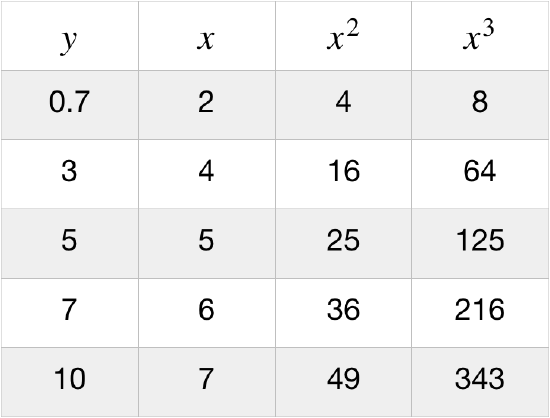
Using the data in the figure above with every grid line equal to one unit, we can create a table, and plot the points on a grid for each of the two prospective functional dependences. In this particular case, the \(y\)-vs-\(x^2\) plot displays the decidedly more linear form, while the \(y\)-vs-\(x^3\) plot is quite obviously convex in shape. In other words, it is easier to fit a straight line to the \(y\)-vs-\(x^2\) plot than it is to fit it to the \(y\)-vs-\(x^3\). We therefore conclude that between these two choices, the dependence of \(y\) on \(x\) is quadratic rather than cubic.
Figure 2.1.2 – Creating Prospective Linear Plots
[As it has been expressed here, this is not a particularly quantitative way of determining which of the prospective functions is correct, but there is certainly a way to make it so. This basically consists of computing the aggregate of how far the data points deviate from the best-fit line. This gives a measure of how well the curve fits – called the R-value of that curve that varies from +1 to –1. The closer the absolute value of the R-value comes to 1, the better the curve fits the data. We won't go so far as to calculate R-values in this class, but you will likely run across it in another some other experimental science or statistics class.]
Some Final Comments
We get an added bonus by creating these linear plots. Note that the slope of the linear plot is the unknown constant of proportionality for the power law. We can find this constant by drawing our best-fit line, then selecting two points on the line and computing \(\dfrac{\Delta y}{\Delta x}\). There are two important things to keep in mind while doing this. First, you are using the line to determine the slope, not two actual data points. So the two points used in the slope calculation must lie on the best-fit line. Second, in order to get as accurate a measurement as possible for the slope of the line, it is best to choose two points on the line that are as far apart on the graph as possible – if you choose two points that are close together, then a small absolute error in the reading of the \(x\) and \(y\) coordinates turns into a large percentage error in the ratio. It's also possible to derive information from the \(y\) intercept of the best-fit line. This will obviously give an additive constant, which, if it is not supposed to be part of the physics, can reveal a systematic error (e.g. every measurement of one of the variables was off by the same amount).
Note that if we have only two data points, then literally any curve can be made to fit, which means we get no information about functional for from only two data points. While two points are sufficient to determine the slope of a line, they are insufficient to determine the curvature (second derivative) of a non-line. If there are three points, then the curvature of a parabola that fits these points can be determined, but a cubic function can also be perfectly fit to those three points. The result is that as the power of the prospective curve grows, more data points are required to distinguish prospective functions. Of course it is always better to have more data points, but at a minimum, to distinguish between power laws with powers \(n\) and \(n+1\), at least \(n+2\) data points are needed.
It's also useful to note that the curvature of a graph is more apparent when the points are spread out. That is, a parabola can look like a straight line when points that are close together are plotted. Note that in the two graphs above, the horizontal axes are scaled so that the two most distant data points are at opposite ends of the graph.