2.3: Figures
- Page ID
- 34682

\( \newcommand{\vecs}[1]{\overset { \scriptstyle \rightharpoonup} {\mathbf{#1}} } \) \( \newcommand{\vecd}[1]{\overset{-\!-\!\rightharpoonup}{\vphantom{a}\smash {#1}}} \)\(\newcommand{\id}{\mathrm{id}}\) \( \newcommand{\Span}{\mathrm{span}}\) \( \newcommand{\kernel}{\mathrm{null}\,}\) \( \newcommand{\range}{\mathrm{range}\,}\) \( \newcommand{\RealPart}{\mathrm{Re}}\) \( \newcommand{\ImaginaryPart}{\mathrm{Im}}\) \( \newcommand{\Argument}{\mathrm{Arg}}\) \( \newcommand{\norm}[1]{\| #1 \|}\) \( \newcommand{\inner}[2]{\langle #1, #2 \rangle}\) \( \newcommand{\Span}{\mathrm{span}}\) \(\newcommand{\id}{\mathrm{id}}\) \( \newcommand{\Span}{\mathrm{span}}\) \( \newcommand{\kernel}{\mathrm{null}\,}\) \( \newcommand{\range}{\mathrm{range}\,}\) \( \newcommand{\RealPart}{\mathrm{Re}}\) \( \newcommand{\ImaginaryPart}{\mathrm{Im}}\) \( \newcommand{\Argument}{\mathrm{Arg}}\) \( \newcommand{\norm}[1]{\| #1 \|}\) \( \newcommand{\inner}[2]{\langle #1, #2 \rangle}\) \( \newcommand{\Span}{\mathrm{span}}\)\(\newcommand{\AA}{\unicode[.8,0]{x212B}}\)
You are free to choose the software for preparing the figures in your lab report. The software must be able to produce plots of professional scientific quality, including horizontal and vertical error bars, text labels, multiple curve and data point types, and logarithmically-scaled axes. We specifically recommend Python’s Matplotlib module, GNU Octave, Matlab, or Origin (the first two are free).
Here are some issues to watch out for when making plots:
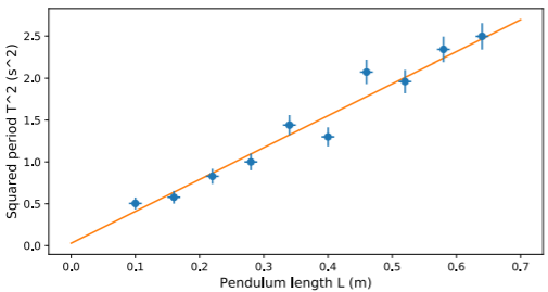
- All data points must have error bars—preferably both vertical and horizontal error bars—unless there’s a good reason otherwise.
- Axes must be clearly titled, including units. If space permits, axis titles should have descriptive text, not just symbols; e.g., “Applied force \(F\) (mN)” is better than “\(F\) (mN)”.
- If a graph has multiple sets of curves/data points, they must be distinguishable (e.g., solid versus dashed curves, or circular versus triangular data points). The different sets should be labeled in the figure and/or described in the caption.
- The figure must have a caption describing its contents. Never worry about putting “too much” in the captions; in particular, it is OK to have overlap between the contents of the caption and the main text.
- All text in the figure (including the legends, axis labels, and axis titles) must be big enough to read. As a rule of thumb, figure text should be 60–100% the size of the regular text in the manuscript, and no smaller. If your plotting program produces text that’s too small by default, adjust it yourself.
An example of a good figure is shown in Fig. \(\PageIndex{1}\). Note the error bars, the axis titles and labels (which are in legible sizes, with units), and the description of the best-fit line in the caption. Some examples of bad figures are given in Appendix 2.5.